Etisalat announced a completely new brand identity and logo on 23 February, making big changes that took many by surprise. We take a look back at the company’s past logo designs and track the evolution of Etisalat’s branding since its inception in 1976.
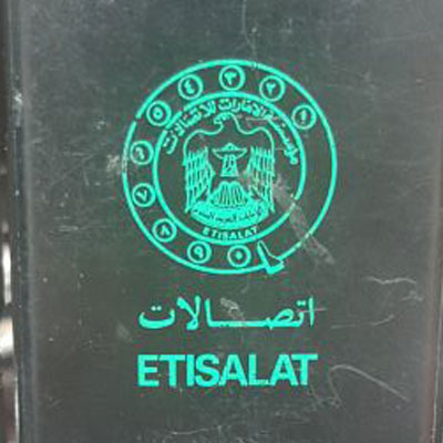
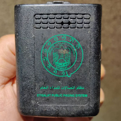
An early incarnation of the Etisalat logo
This is the earliest version of Etisalat’s logo we can unearth.
We believe was in use from 1976 to 2000.
2000 Rebrand
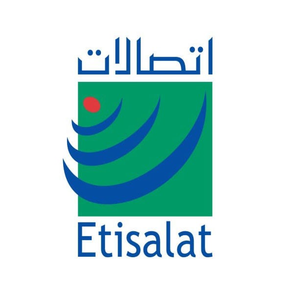
This logo, which includes a red dot and three blue curves, was a clear visual representation of mobile phone communications. The dot represents the origin of the signal, while the blue curves represent the signal itself.
2000 – 2006
2006 Rebrand
In 2006, Etisalat embarked on its 2nd major rebrand and changed to the logo that we’re all familiar with. This accompanied a restructuring program designed to make the company internationally relevant. The logo was designed to match the brand’s core values, including transparency, optimism, openness, simplicity, and reliability.
Again, the symbol represents a stylised graphic version of a signal being projected.
2006 – 2022
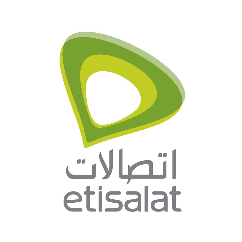
Green is the national colour of the UAE, of course, and was also chosen as the brand colour because it symbolises life, growth, and renewal. Overall, the new logo was a refreshed and more contemporary look for Etisalat.
What does the new Etisalat logo look like?
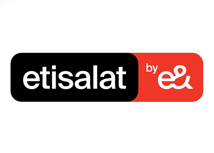
Why did Etisalat change its logo?
Founded in Abu Dhabi and based in the UAE, Etisalat has come a long way and is now one of the largest telecom providers in the world. With operations across Africa, Asia, and the Middle East, it now serves over 170 million customers worldwide.
The new brand identity is an effort to connect with that global customer base and equip the company to expand into new territories.
Did Etisalat change its name in the UAE?
Not quite, but there is a new brand identity for Etisalat UAE.
The ‘Etisalat’ name remains in use within the UAE, but will now be known as ‘Etisalat by e&’. The local rebrand has tweaked the name and revamped the logo, bringing Etisalat UAE in line with the new e& brand of its parent.
The parent company, formerly know as Etisalat Group, has changed its brand identity to ‘e&’
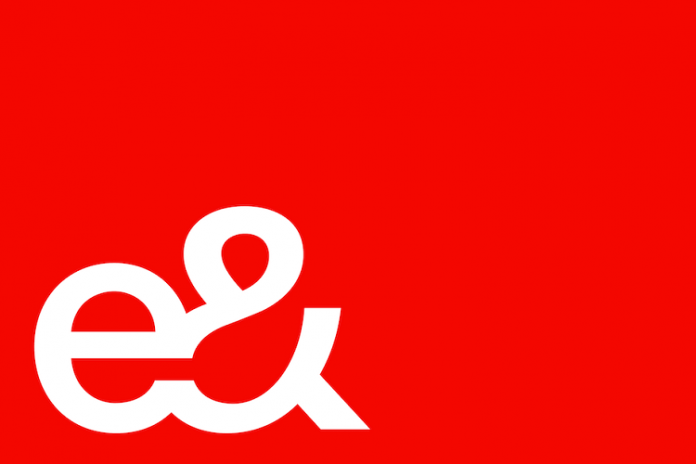
What is e&?
Etisalat Group (the parent company) is now known as ‘e&’.
The “e” in the new logo is meant to represent both “electronic” and “ethernet,” signifying the company’s move toward a digital future. This is said to reflect the company’s renewed focus on digital transformation.
How do you pronounce e&?
There has been some confusion on the internet about how to pronounce the new brand name. If you’ve heard their radio ads, you’ll know it’s pronounced ‘E and.‘
There you have 4 decades of Etisalat branding evolution. The new name for the group is intended to better fit the global technology and investment conglomerate and its expansion strategy – while local branding for the UAE retains its homegrown roots.
